Skip to content

Reversal

Helping you manage diabetes, PCOS, thyroid, and hypertension through personalized nutrition, yoga, and stress management.

Services Provided

  • Logo Desining
  • Branding

Technologies Used

Figma I illustrator

Reversal

Reversal is a wellness-focused initiative built around the belief that transforming health is an active and continuous journey. Supporting individuals managing diabetes, PCOS, thyroid conditions, and blood pressure, Reversal brings together structured lifestyle changes with a focus on the whole person. The branding and UI/UX design were created to express this philosophy through a modern, energetic, and human-centred identity, bringing Mind, Body and Spirit together in one cohesive experience.

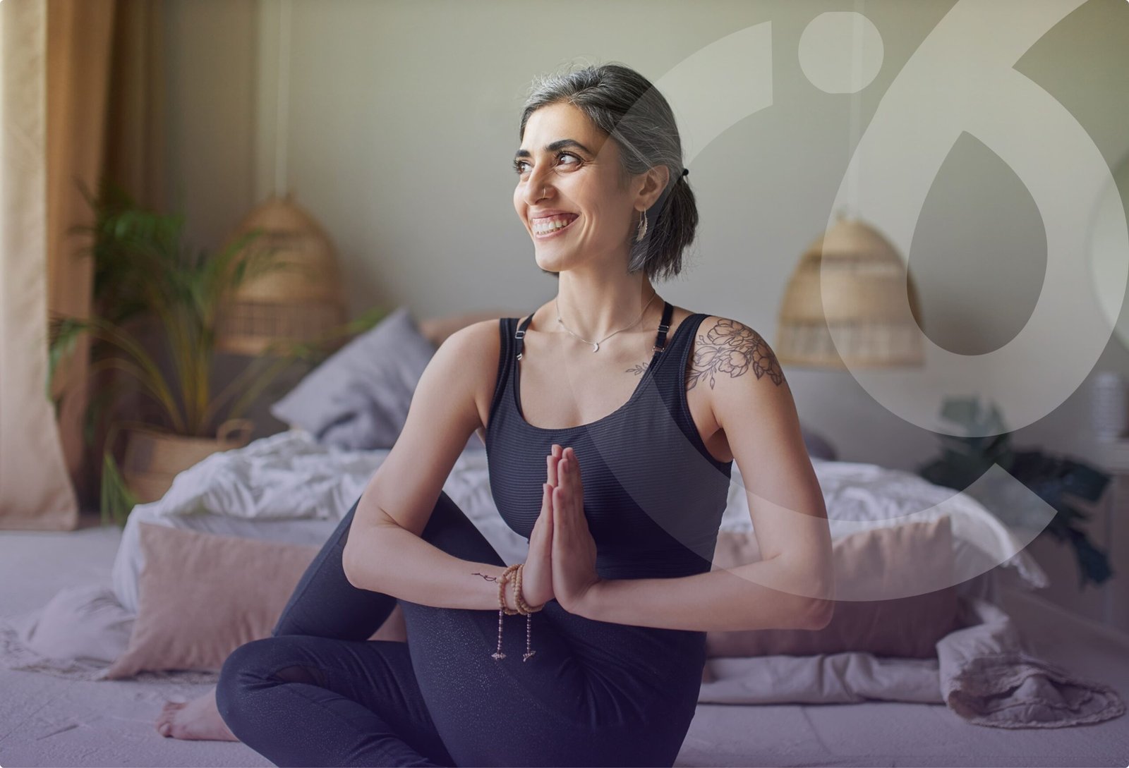
Our goal was to create a brand that makes health transformation feel personal, positive, and achievable. We wanted Reversal to move beyond a clinical approach and embrace a holistic vision of Mind, Body, and Spirit, placing the individual at the heart of the journey.
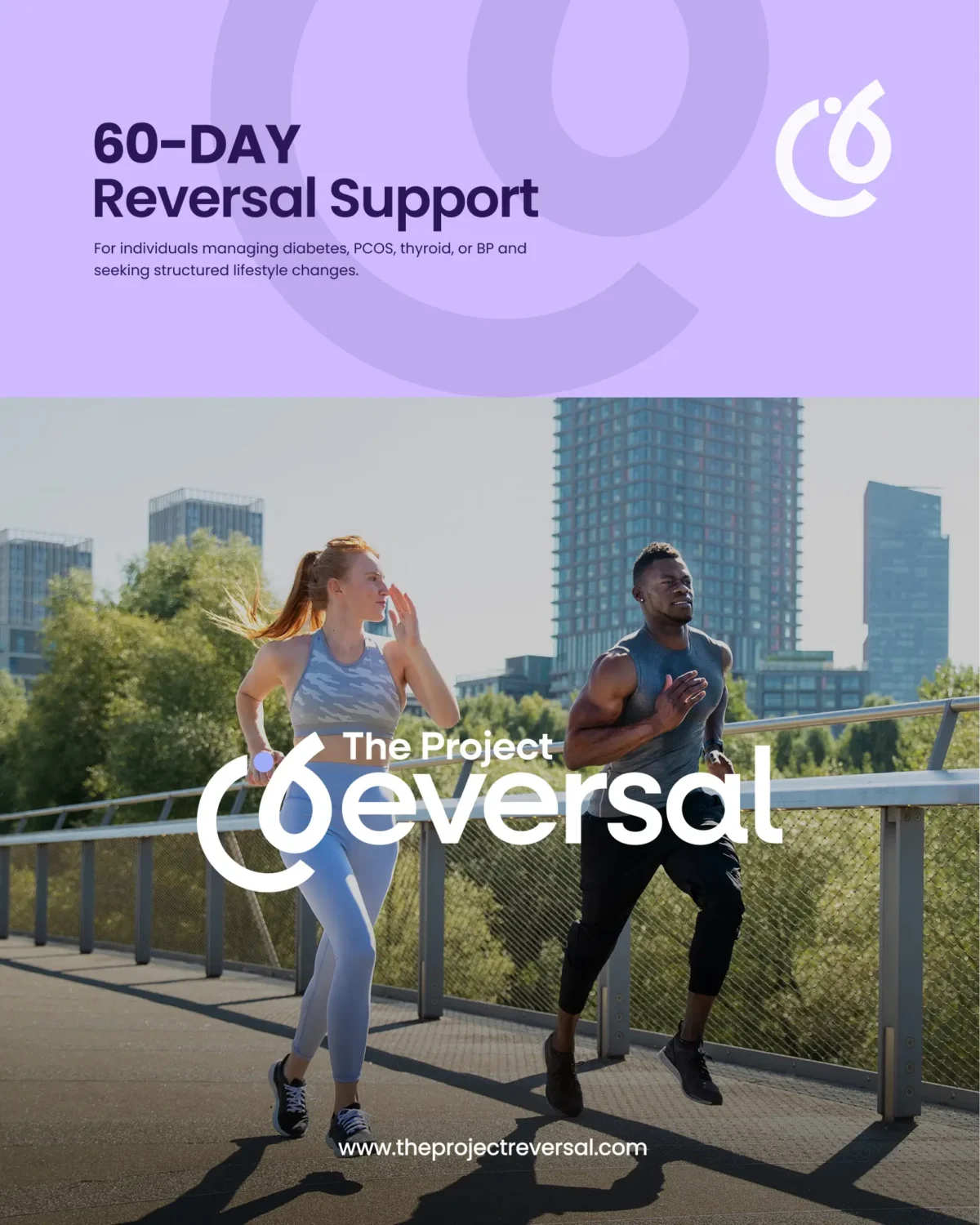
From UI/UX to branding, we aimed to create a modern, trustworthy, and approachable experience that makes the 60-Day Reversal Support journey feel simple, engaging, and human.
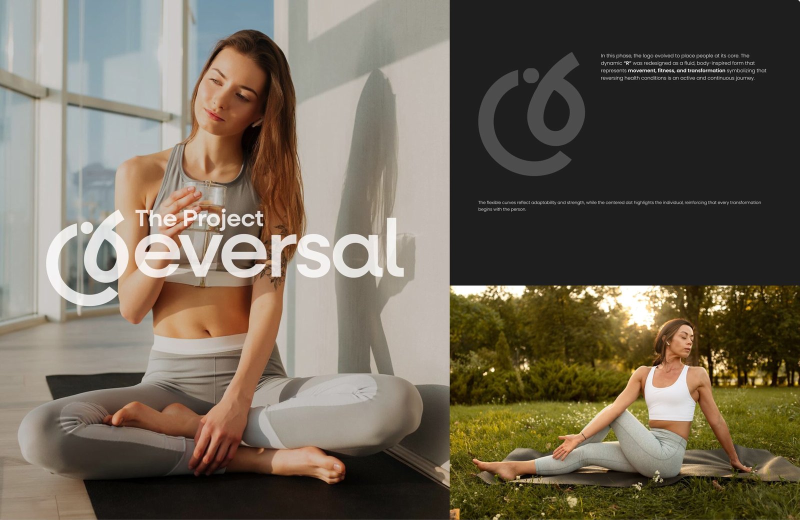

Reversal needed a brand identity that could communicate health transformation without feeling overly clinical or restrictive. The challenge was to represent the idea of reversing health conditions as an ongoing journey—one that requires movement, adaptability, strength, and personal commitment. The identity also needed to feel approachable and contemporary while establishing a sense of trust for individuals looking for structured support in making meaningful lifestyle changes.

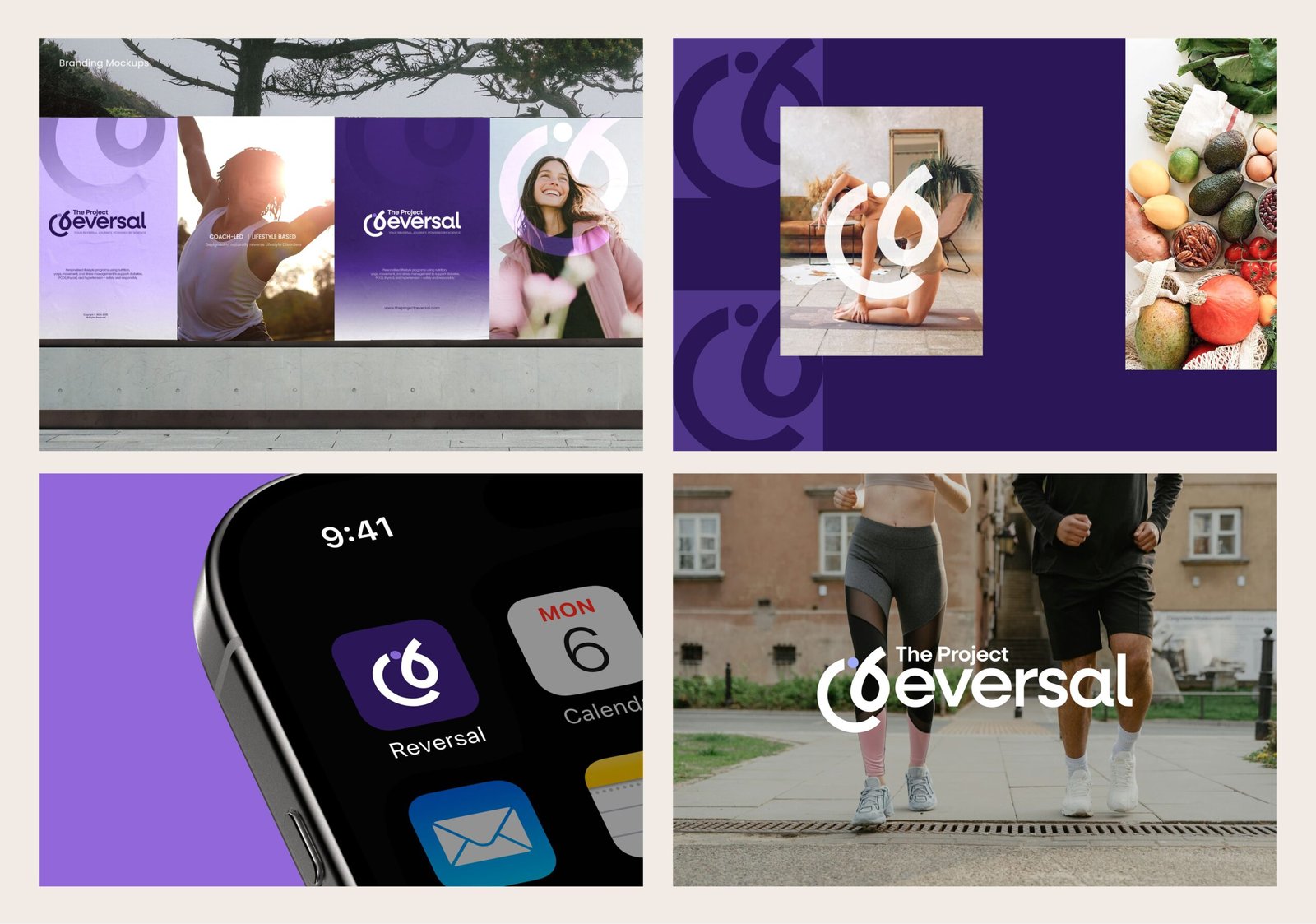
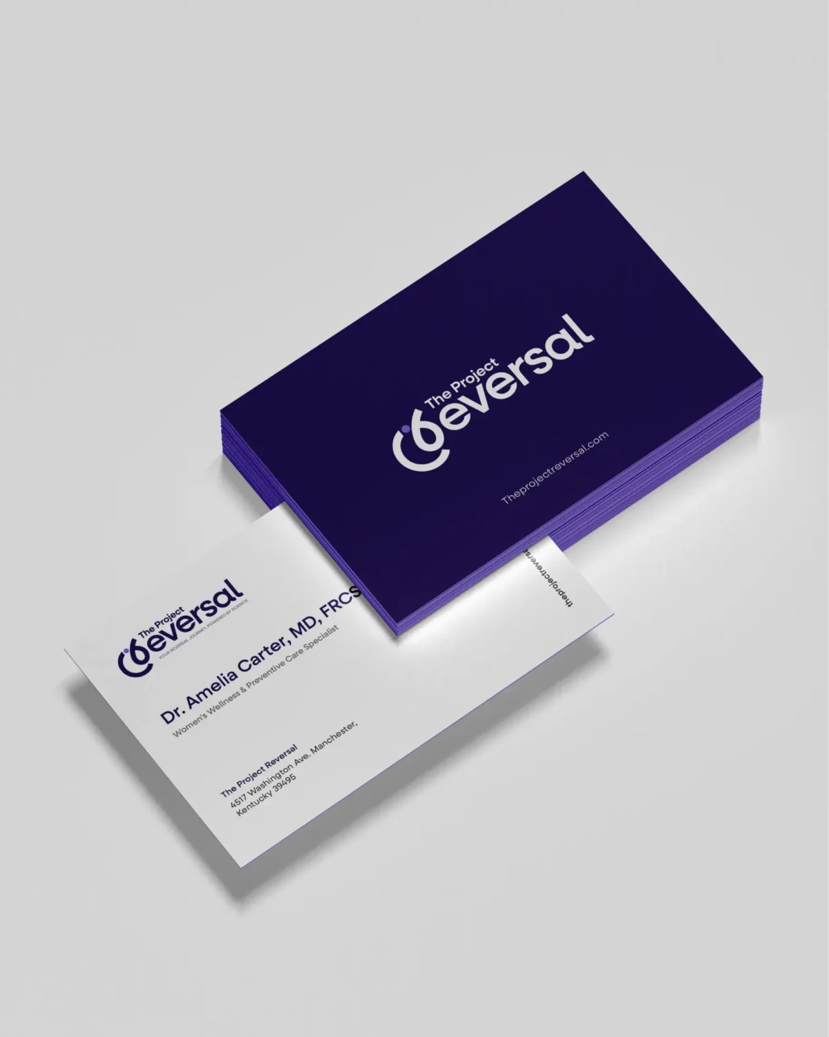
We built the brand around personal transformation, with the dynamic “R” representing movement, fitness, adaptability, and strength. Its fluid form and centred dot place the individual at the heart of the Reversal journey.

This visual language extends into a clean, approachable UI/UX system, supported by a balanced colour palette of Midnight Plum, Reversal Glow, Pure Harmony, Vital Glow, and Deep Teal Core. Poppins adds a modern, precise, and approachable feel to the overall identity.

The result is a distinctive wellness identity that makes transformation feel personal, active, and achievable. By combining a fluid visual identity with an approachable digital experience, Reversal moves beyond a traditional healthcare aesthetic and creates a brand that reflects the complete wellness journey of the individual. The final design establishes a consistent expression of Mind, Body, and Spirit, while giving the 60-Day Reversal Support programme a clear and engaging platform for people seeking structured lifestyle change.

Let's Build the Digital Presence Your Business Deserves — And Keep Growing It